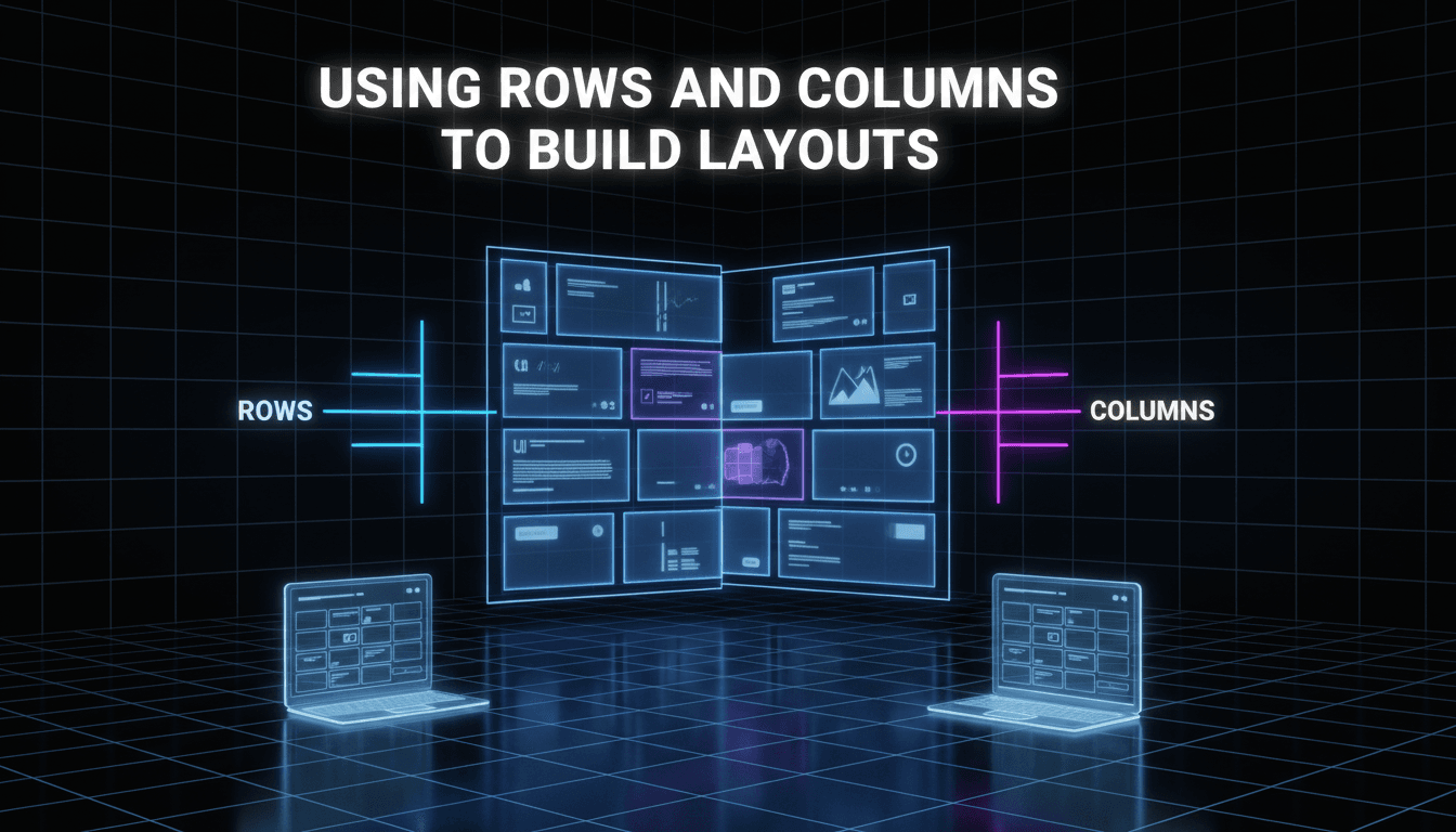
Using rows and columns to build layouts
Layouts on your website work like a grid. To keep your text, images, and products organized, you use rows and columns. This ensures your content stays aligned and looks professional on both desktop computers and mobile phones.
How to build a layout
The Row Layout block is the main tool you’ll use to structure your pages. It allows you to split a section into multiple vertical columns.
- Add a Row Layout block: Click the + icon in the editor and search for "Row Layout."
- Select your columns: A menu will appear asking how many columns you want. You can choose a single column, an even split (50/50), a three-way split, or asymmetrical options (like 70/30).
- Insert your content: Each column has its own + icon. Click it to add blocks like images, headings, or buttons inside that specific column.
- Adjust the width: If you want your content to stretch across the whole screen or stay contained in the middle, select the Row block and use the alignment icons in the top toolbar to choose "Wide width" or "Full width."
- Fine-tune the spacing: With the Row block selected, look at the settings sidebar on the right. Under the Padding/Margin section, you can add space above or below the row to prevent your content from looking cramped.
Common layout scenarios
- The "Feature" section: Use a three-column row to highlight three key services or product categories. Add an icon at the top, a heading in the middle, and a short description at the bottom of each column.
- The "About" section: Use a two-column row with a 50/50 split. Place a photo of your storefront or team in the left column and your brand story text in the right column.
- A Call to Action: Use a single-column row. Center-align a bold heading and a "Shop Now" button to grab the visitor’s attention.
Troubleshooting and tips
My columns look great on desktop but messy on mobile.
By default, columns stack on top of each other on small screens. If your text is touching the very edge of the phone screen, select the Row Layout block and add "Padding" (usually 20px or 30px) to the left and right sides in the mobile view settings.
The images in my columns aren’t the same height.
If you have three images side-by-side and they look uneven, it’s usually because the original images have different aspect ratios. For the cleanest look, crop your images to the same dimensions before uploading them.
I can’t find the settings for the whole row.
It can be tricky to click the "Row" when it’s full of content. Use the List View (the icon that looks like three horizontal lines at the top left of your editor) to see a tree map of your blocks. Click "Row Layout" there to select the entire container.
Everything is too close together.
Use the Gutter setting in the Row Layout sidebar. This adds a specific amount of space between your columns so your text doesn’t run into your images.
Quick Recap
Rows hold columns, and columns hold your content. Start with a Row Layout block every time you want to move away from a single column of text.
Next steps to explore:
- Adding background colors to rows
- Setting up a mobile-specific menu
- Using the Kadence Design Library for pre-made layouts