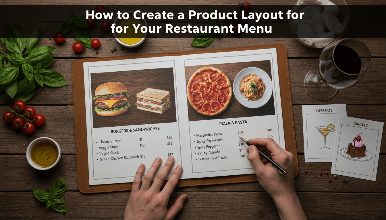
How to create a product layout for your restaurant menu
A restaurant menu layout needs to be easy to scan. Unlike a standard online shop that uses large square boxes, a menu usually looks best as a clean list with clear pricing and brief descriptions. Using WooShop’s built-in Kadence tools, you can move away from the traditional "grid" and create a professional digital menu.
1. Organize your products by category
Before touching the design, group your items. Navigate to Products > Categories in your dashboard. Create categories like "Appetizers," "Main Courses," and "Drinks." Assign each of your dishes to the correct category so they appear in organized sections on your page.
2. Create your Menu page
Go to Pages > Add New and title it "Menu." Instead of using the default shop page, you’ll build this page using Kadence Blocks. This gives you total control over how each section looks.
3. Add the Product Query block
Inside the page editor, click the + icon and search for "Product Query." This block pulls your products into the page.
- In the block settings on the right, look for Filters.
- Select Product Categories and choose "Appetizers."
- This ensures only your starters show up in this specific section.
4. Switch to a list layout
By default, the block might show a grid. To get that classic restaurant feel:
- In the block settings, look for the Layout tab.
- Choose a single-column layout.
- Adjust the "Media" settings to place the product image to the left of the text rather than on top.
- If you don’t use photos for every dish, you can toggle the image off entirely for a minimalist text-only menu.
5. Style the text and pricing
In the editor, click on the Product Title and Price elements within the block.
- Set the title to a readable font size (18px–20px works well).
- Change the price color to stand out, or place it right next to the title.
- Use the Product Short Description block to show ingredients or dietary notes (like "Vegan" or "Gluten-Free").
6. Repeat for other sections
Once your Appetizers section looks right, click the three dots on the block and select Duplicate. Change the category filter in the new block to "Main Courses." Repeat this for every section of your menu.
Practical examples
- The Minimalist Bistro: Disable all product images and use a single-column list. This creates a high-end, text-heavy look common in fine dining.
- The Fast-Casual Cafe: Use small, circular thumbnail images to the left of the dish name. This helps customers identify food quickly without taking up too much vertical space.
- The Digital Order Menu: Keep the "Add to Cart" button visible under each item so customers can order directly from their table via a QR code.
Troubleshooting
The images are different sizes and look messy.
Go to Appearance > Customize > WooCommerce > Product Images. Set the "Thumbnail Cropping" to 1:1 or a specific ratio. This forces every menu photo to be the exact same shape.
Items are appearing in the wrong order.
WooCommerce orders products by date by default. To fix this, go to Products > All Products, click Sorting at the top, and drag your dishes into the order you want them to appear on the menu.
The "Add to Cart" button is taking up too much space.
If you are only using the menu for display and not for online ordering, you can select the "Add to Cart" block within your query and hit backspace to delete it.
Recap
Building a menu involves categorizing your items and using the Product Query block to display them in a list format. This keeps your layout organized and mobile-friendly for diners.
Related topics:
- Setting up product attributes for dietary restrictions
- How to create a QR code for your digital menu
- Adjusting global button styles in Kadence