Description
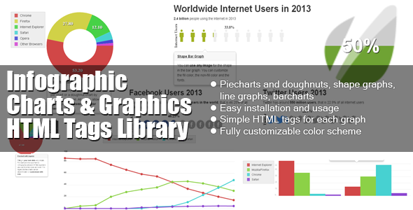
This custom JS charting library created by PSDDude from 0 implements custom HTML tags which allow creating charts and graphs for infographics.
It is a light-weight, pure JavaScript charting library (NO jQuery or other libraries required) which makes use of HTML5 technologies and works on all modern browsers including IE, Chrome, Firefox, Opera, Safari.
To use it you do not need to know any JavaScript, as all the charts are added as HTML tags. You can follow the very straight forward infographic library documentation which also contains examples.
The library allows creating:
– Piecharts and doughnuts
– Shape graphs – you can transform any image(PNG) into a graph
– Shape bar graphs – use any image (PNG) to construct a bar chart
– Line graphs
– Barchart graphs
Extensive easy to use documentation included.
Easy customization: color scheme, size, etc.
BONUS:
FREE WordPress Charts and Graphs plugin for adding infographics to your posts and pages.
Did you know that you can manually insert HTML bar charts in your WordPress posts and pages?
Check out the infographic javascript library project page for planned features
Change log
v 1.0.6 Dec 30, 2018
- fixed problem with legend display
v 1.0.5 Mar 3, 2018
- line chart can now display values for points. use point-text-* attributes to configure how the point values are displayed
v 1.0.4 May 1, 2015
- bar chart new attribute “max-value” – sets the maximum range of the grid; default is 0 which means that the actual maximum value of the data series determines the range of the grid;
- bar chart new attribute “bar-labels” can be true or false – determines whether to draw labels for each bar; default is false;
- for line charts you can specify individual point sizes through a new attribute on the “infographic-point” element named “point-size”; by default the “point-size” value of the “infographic-line” is taken into account
- for bar charts it is now possible to add marker images for each bar through the attribute “marker” set on the “infographic-bar” tag
v 1.0.3 Jul 17, 2014
- charts are now responsive; use % for width and the charts size will be adjusted according to the size of the element where inside which it is placed and it will also resize with the window;
- for piechart and doughnut charts added the attribute “start-angle” to indicate the starting point at which the slices will be drawn; this attribute is in degrees (from 0 to 360 but it can be any number even negative);
- for piechart and doughnut chart if only one slice value is used it will be treated as a percentage value; you can also use it as a value if the attribute “label-type” is set as “value” – set the newly added attribute “base-value” as a calculation base for displaying the chart (eg. if the slice value is 50, the “label-type” is set as “value” and the “base-value” is set to 200, the chart will display a slice 50 / 200 = 25%)
v 1.0.2 Apr 9, 2014
- for line graph added the “x-axis-labels” attribute to indicate if the graph should display labels on the X-axis
- bar graphs can now be configured to display as stacked bar graphs by setting the “bar-type” attribute to “stacked”
- for piechart/doughnut added the “padding” attribute to indicate the space between the outer circumference of the chart and the bounding box of the chart
- for piechart/doughnut added the “highlight-mode” attribute to indicate how to highlight slices on mouse-over; the highlight can be “default” for color highlight only, “pop” for highlighting by popping out the slice and “border” for highlighting by adding an exterior border around the slice
- for piechart/doughnut added the “highlight-size” attribute which works in conjunction with the “highlight-mode” attribute to indicate the size of the popping out effect for “pop” and the width of the border for “border” highlight mode
v 1.0.1 Jan 13, 2014
Click here to view new features examples
- added the “label-type” attribute to piechart/doughtnut which allows representing either percentage (“percent”), value (“value”) or hiding the slice label
- added the “label-decimals” attribute to piechart/doughnut for indicating the precision of the number displayed on each slice
- added the “label-unit” attribute to piechart/doughnut for indicating the name of the measure unit used on each slice (eg. millions, billions, pcs, etc.)
- added the “hole-size” attribute for doughnut charts to indicate the size of the center hole
- added support for displaying CSV data for the line graph (eg. you can export CSV data from GoogleAnalytics and use that file as a parameter for the graph and it will display it accordingly)
- line graph and bar graph has been adjusted to also support displaying of negative values


Reviews
There are no reviews yet.