Description
This item put all my exist WPBakery Page Builder (formerly Visual Composer) add-ons ($250+ value) in one bundle for only $25, and will add more add-ons for free in the future update. All the add-ons are in a simple design and extend WPBakery Page Builder with more function. This bundle works fine with WPBakery Page Builder that installed as plugin or in a theme. The addon will load the javascript/css assets on the fly, and you can choose to enable/disable each addon via the Role Manager of the page builder.
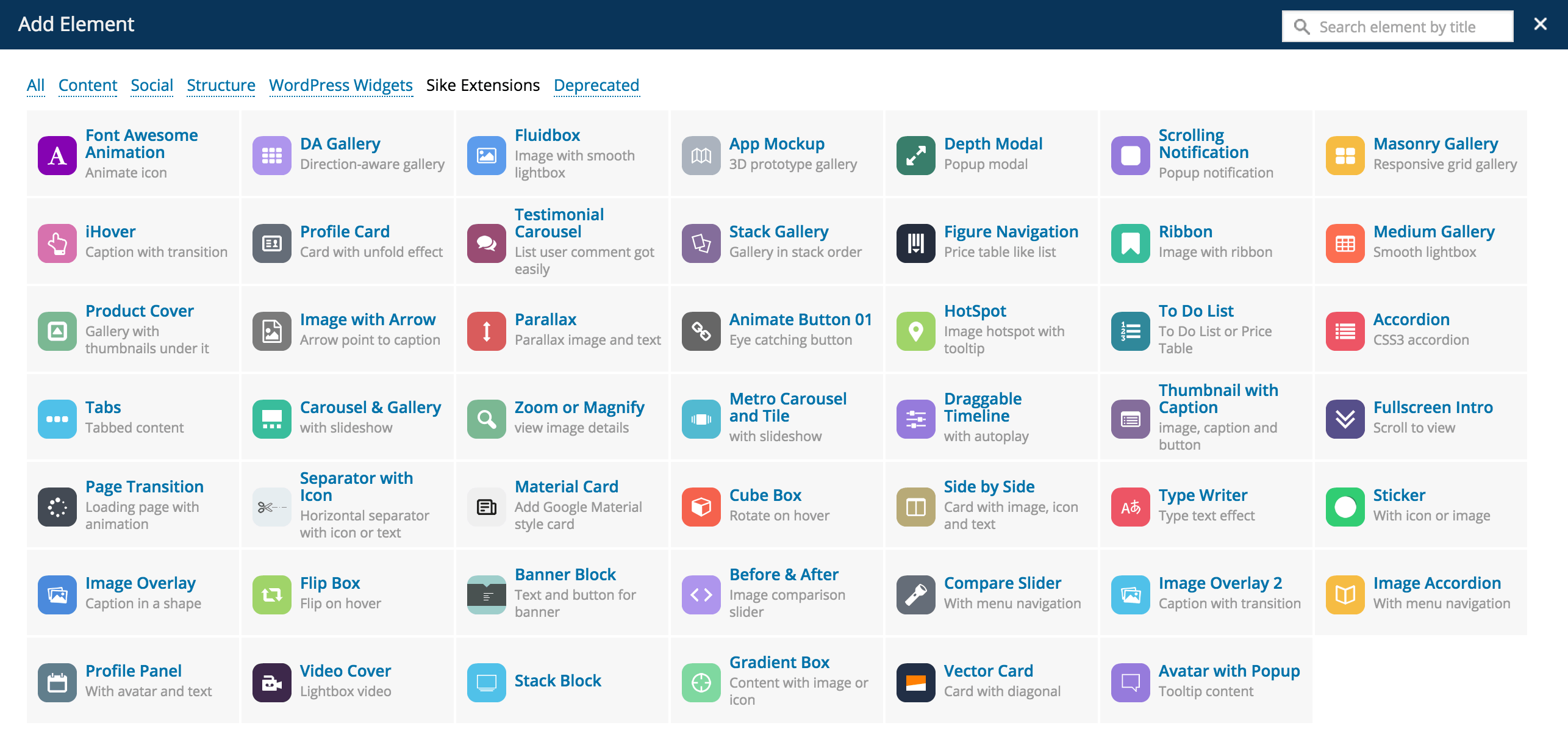
Note: This plugin is the addon for WPBakery Page Builder (formerly Visual Composer), it requires WPBakery Page Builder to be installed and activated on your site. Some of the 3D CSS3 transition features are only available in modern browser like Chrome, Firefox, Safari, Opera or IE10+. The HotSpot element need the frontend editor enabled to drag to update the icon’s position.


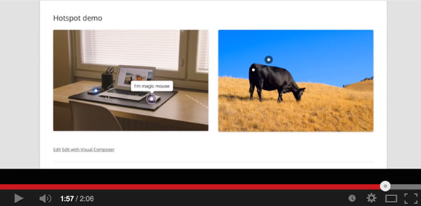
You can drag the hotspot icon to update it’s position in the frontend editor, click the image to see a Youtube vide demo:
Reviews

Included:
YouTube or Vimeo Video Gallery 
Help you to add YouTube or Vimeo video gallery, with thumbnails and caption or optional tooltip.
Compare Card 
Display 2 cards side by side, support button and avatar lightbox, lightbox can be image, youtube video or google map etc.
Parallax Slider 
auto delay slideshow with image, caption, arrow and dot navigation.
Timeline Card 
Give the flexibility to add responsive timeline card with image, youtube video or google map etc
Material Slider 
Help you to add a Google Material style auto delay slider easily.
Skew Box
Help you to add 2 side by side image with text box, you can add a compare slider with it.
Shadow Card
Help you to add Apple TV like 3D tilt hover image, with optional caption below.
Expand Grid
- CSS3 flex box driven design, make it responsive and expandable.
- Optional avatar, avatar support icon or image, icon with WPBakery Page Builder built-in Icon Picker.
- Auto delay slideshow
- Built-in gradient color style, also support customize color.
- Add content easily via the WordPress built-in rich text editor, help you add any HTML (like a link) easily.
- Optional tooltip.
iHover
- CSS3 transition.
- 20 transitions for the circle, 15 transitions for the square.
- Both transition support left_to_right, right_to_left, top_to_bottom and bottom_to_top.
- Thumbnail support custom link or lightbox.
- Retina ready, you can choose to display the thumbnail in retina.
Image Hotspot with Tooltip, support lightbox
- You can customize each hotspot icon’s postion easily in the WPBakery Page Builder Frontend editor.
- Hotspot link support YouTube, Vimeo video, image or google map as lightbox.
- Hotspot icon support Font Awesome icon or numbers, numbers or single dot.
- Hotspot icon (and the circle dot) support any kind of color.
- Responsive and retina ready.
- Hotspot icon support pulse animation, and can be in white, gray, red, green, blue or purple.
- Optional open every tooltip by default when page loaded.
- Tooltip support any kind of content, like a image or video.
- Optional tooltip style: shadow, light, noir, punk.
- Optional tooltip animation: grow, slide, fade, fall.
- Optional tooltip arrow position: top, right, bottom, left, top-right, top-left, bottom-right, bottom-left.
Flip Box 
- Optional background image on both sides.
- Optional avatar, support circle image or icon.
- Avatar support circle image or icon.
- Icon support built-in Icon Picker after WPBakery Page Builder 4.4
- Responsive and retina ready.
- Avatar can be on both sides or fixed on the top.
- Optional link for the whole element.
- Optional link button on the back sides.
- Smooth CSS3 flip transition.
Gradient Box 
- Optional avatar, avatar support icon or image, icon with WPBakery Page Builder built-in Icon Picker.
- Avatar (icon or image) can be in circle, rounded small, rounded large or square.
- Whole box can be in square, rounded small, or rounded large.
- Built-in gradient color style, also support customize color.
- Content area can be align vertically center or with padding only.
- Optional background color for the content area, help you make a gradient border looking.
- Optional icon background.
- Optional link for whole box.
- Add content easily via the WordPress built-in rich text editor, help you add any HTML (like a link) easily.
- Optional tooltip for whole box.
- Box title align can be in left, center or right.
- And more…
Before & After 
- Icon Picker support after WPBakery Page Builder 4.4
- Optional auto delay slide.
- Unlimited icon color option.
- Built in handle style.
- Optional tooltip for the handle.
- Retina, responsive.
Cube Box 
- Optional background image on both sides.
- Optional avatar, support circle image or icon.
- Avatar support circle image or icon.
- Icon support built-in Icon Picker after WPBakery Page Builder 4.4
- Responsive and retina ready.
- Optional link for the whole element.
- Smooth CSS3 cube transition.
Parallax
- Optional images, text content, you can choose image or text to display first.
- Optional text content color, text content background, text content padding.
- Optional container width.
- Images support custom link.
- The parallax is disabled in the mobile view, keep the images and texts readable.
Draggable Timeline
- Timeline label support Font Awesome icon, image or plain text only.
- Icon and image can be in square, round or circle shape.
- Auto play slideshow for the timeline.
- Auto scrollbar support for the long content in the timeline window.
- Retina ready.
- Optional bar color, timeline window color style, label font color.
- Optional drag button.
- Optional timeline title, timeline content.
Page Transition
- Animation in 2 modes: normal or overlay mode.
- 58 different animations.
- Optional overlay color.
- Optional page in and page out animation speed.
Thumbnail with Caption
- Thumbnails support lightbox or custom link.
- Auto play slideshow for the thumbnails.
- Retina ready and responsive.
- Optional caption title, caption content and button.
- Optional caption and button background color.
Separator with Text or Icon
- Text or icon support link.
- Multiple icon, you can choose to display 1~5 same icon in a separator.
- Optional shape, border style (solid, dotted, dashed, gradient color), font color, background color, border color, font-family for the text, element width, margin of the whole separator etc.
Fullscreen Intro
- Background can be in (repeat or no-repeat) image or solid color.
- Optional intro text, Font Awesome icon under intro text, optional font-size, font-color, font-family, intro text position.
- Optional click the intro text to scroll, optional element for the scorll to element, optional scroll speed, scroll offset.
- Optional container height.
Metro Carousel and Tile
- You can choose to display the image in Carousel or Tile mode.
- Navigation button in Carousel support these position: bottom-left, bottom-center, bottom-right, top-left, top-center, and top-right.
- Navigation button in Carousel can be one of these 3 type: default(short line), cycle, and square.
- Navigation button in Carousel with 12 active color options available.
- Slide animation support: slide, fade, switch, or slowdown in the Carousel mode.
- Slide effect support: slideLeft, slideRight, slideLeftRight, slideUp, slideDown, and slideUpDown in the Tile mode.
- Thumbnails support lightbox or custom link in both mode.
- Auto play slideshow in both mode, you can customize the delay time in the editor.
- Retina ready and responsive.
- Metro UI CSS driven, include the necessary component only, keep the files lightweight.
Carousel & Gallery
- You can choose to display the images in Carousel or Gallery.
- Optional dot and arrow navigation.
- Carousel support lightbox or custom link.
- Retina ready, responsive.
- Auto play slideshow.
- Optional tooltip for the thumbnails.
- Optional container width and max-width, align center automatically.
Zoom or Magnify (image)
- You can choose to display the image in Zoom or Magnify mode.
- In Zoom mode, you can choose the control bar position, container background pattern, container width etc in the backend.
- Control bar can be in top, bottom, left, or right.
- Zoom image can be displayed in retina.
- In the Magnify mode, you can customize the glass radius, border size, border color, apply gray filter to the image, how to move the magnify glass(press or mouseover), customize the default position of the glass when page loaded etc.
Tabs
- Optional tabs menu title, unlimited menu color, menu background, content color, content background.
- Tab menu support Font Awesome icon.
- 3 available tabs style.
- Smooth transition.
- Retina ready.
- Unlimited tabs item, content support any kind of content.
- Optional auto delay rotate for the tabs.
- Optional container width, align center automatically.
CSS3 Accordion
- Optional accordion menu title, menu color, menu background, menu background pattern, content color, content background, font size etc.
- 2 available accordion style.
- Smooth CSS3 transition.
- Responsive and retina ready.
- Unlimited accordion item, accordion support any kind of content.
- Optional border.
- Optional container width, align center automatically.
Image with Arrow
- Optional image, text content, content position can be in top, right, bottom or left.
- Image can be opened as lightbox or custom link.
- Retina and responsive.
Optional content color, content background, font size, arrow position,
Product Cover Gallery
- Optional cover image, cover label, label color, caption when user hover.
- Optional thumbnails when user hover, thumbnail can be opened in current view, lightbox or custom link.
- Retina and Responsive.
Medium Gallery
- Optional layout of the Medium Gallery, you can manually set a string of numbers to specify the number of images each row contains in the gallery.
- Optional gallery width, gutter, title and alt for the image in the Medium Gallery.
- Optional ribbon label, ribbon link, position, ribbon background, ribbon color, image link etc in the Ribbon add-on.
- Retina and Responsive.
To Do List or Price Table
- You can customize it to a to do list or price table.
- Optional front-end only interactive for the to do list.
- Font Awesome icon 4.2, optional color for each icon.
- Responsive and retina ready.
- Optional header text, color, background, background pattern.
- Unlimited item list.
- Optional label divider inside the list.
- Optional button under the item list.
- Optional divide each item with background or border.
Figure Navigation
- Optional figure label, background, color, border color, title, description and font size etc.
- Support other VC shortcode, for example you can put the VC buttons inside the content.
- Optional background image for each block, you can choose the image repeat or not.
- Optional header image and image size.
- Retina, you can choose to display the header image in retina or not.
- Optional block height, block background.
- Optional display which block by default.
Stack Gallery
- Optional image, optional image size, image border, optional retina image.
- Optional tooltip for each image.
- Optional ease in and ease out animation.
- Retina and responsive.
- Optional arrow navigation, optional arrow color (white/black).
- Optional container height, container background.
- Optional auto delay slideshow, and the delay second.
Testimonial Carousel
- Optional avatar, optional avatar size and CSS margin, optional retina avatar, optional link for each avatar.
- Optional testimonial number to be displayed by default.
- Optional testimonial width, background and text color, font-family, font-style and font-size.
- Optional auto play and the slideshow delay second.
- Optional infinite loop for the carousel.
- Font Awesome icon support.
- Responsive and retina ready.
- Optional icon size, color, position.
Masonry Gallery
- Responsive grid.
- Optional thumbnail width, thumbnail padding, container offset, minWidth of the lightbox image.
- Thumbnail support lightbox, custom link, thumbnail image can be in retina.
Scrolling Notification
- CSS3 transition (driven by animate.css, with 20+ transition options) for the popup notification.
- Optional popup window background, text color, width and margin top.
- Notification can be in any position of the page, for example, upper left, upper right, bottom left, bottom right etc.
- Multiple notification, you can add a unique notification for each post or page.
- Optional opacity, position, color, animation style and cookie feature for the notification.
DA (Direction-Aware) Gallery
- 3D hover effect.
- Optional gallery width, thumbnail width, thumbnail margin, caption (thumbnail title and description).
- Optional caption color, caption background, opacity.
- Thumbnail support lightbox, custom link, thumbnail image can be in retina.
App Mockup Gallery
- CSS3 3D effect for the thumbnails.
- Optional thumbnail width, height, container offset, tooltip.
- Thumbnail support lightbox or custom link.
- Optional gradient background.
- Optional retina thumbnail.
Font Awesome Animation
- Support all Font Awesome icon.
- Optional icon size, icon animation, icon color, icon float.
And more..
Included Depth Modal, Profile Card, Fluidbox, Ribbon, Animate Button 01 etc, which are all in simple design, and help you to add an eye catching effect to your site.
Update log
Dec 22, 2020 - version 3.6.1
   - Fixed: HotSpot element compatible with WordPress 5.6 and jQuery on frontend editor.

Sep 1, 2020 - version 3.6.0
   - Fixed: click to slide not working properly in the Drag Timeline.
   - New: Grid Popup, responsive grid gallery with lightbox, support YouTube, Vimeo video, image etc.

July 4, 2020 - version 3.5.9
   - New: Parallax Slider, auto delay slideshow with image, caption, arrow and dot navigation.
   - New: Compare Card, display 2 cards side by side, support button and avatar lightbox.
   - Improvement: Image with hotspot support lightbox, now you can click icon to open a YouTube, Vimeo video, image or google map lightbox.

Jan 7, 2020 - version 3.5.8
   - New: Info Block, add information block with image, text, avatar and button.
   - New: Loading SlideShow, auto delay slideshow with optional loading bar animation.

Nov 7, 2019 - version 3.5.7
   - New: Dot Selection, colorful dots with slide, help you to display product like t-shirt etc.
   - New: Skew Card, skew the image with icon and caption.
   - Improvement: some other small improvement.

Sep 17, 2019 - version 3.5.6
   - New: YouTube or Vimeo Gallery, with thumbnails and optional caption or tooltips.
   - Improvement: some other small improvement.

Jul 26, 2019 - version 3.5.5
   - New: Image Slider, auto delay slideshow slider, support image, youtube and vimeo video
   - New: More Caption V2, slide image with more text description and optional button
   - Improvement: update slick library, and some small fix.

Apr 26, 2019 - version 3.5.4
   - New: Float Caption, caption float left/right for the image
   - New: More Caption, click/hover for more caption for the image

Mar 14, 2019 - version 3.5.3
   - New: News Block, auto delay one by one text news
   - New: Cover Animation, image cover with hover transition
   - Improvement: add scroll to option for the Expand Grid
   - Fixed: shortcode support for the Float Block
   - Improvement: some other small improvement.

Oct 14, 2018 - version 3.5.2
   - New: Card Slider, responsive card slider support auto delay slideshow.
   - New: Image Toggle, support auto delay popup

Jul 21, 2018 - version 3.5.1
   - New: Side by Side V2, add 2 side by side card, support auto delay slideshow.
   - New: User Profile, support social media icon with auto delay popup.
   - Improvement: add alt attribute to most of the image element in the addon.

Mar 27, 2018 - version 3.5.0
   - New: Data Table, add responsive information data table.
   - New: Float Block, add fixed button with popup content.
   - Improvement: some other small improvement.

Feb 6, 2018 - version 3.4.9.8
   - New: Profile Card V2, help you add a card with animation buttons.

Jan 8, 2018 - version 3.4.9.7
   - New: Image Compare, help you add two compare images side by side with caption and buttons.
   - Update plugin name

Dec 6, 2017 - version 3.4.9.6
   - New: Timeline, add responsive timeline, give user flexibility to add timeline style content, icon
   - Fixed: fix click title not open the the content in Accordion
   - Fixed: direction may not working proerply in Vector Card
   - Fixed: fix icon may not display properly in Profile Panel

Oct 19, 2017 - version 3.4.9.5
   - New: Hover Card V2, add auto delay Hover Card, give user more flexibility in the content, avatar, text and social media icon etc.

Sep 4, 2017 - version 3.4.9.4
   - New: Flip Box V2, another new version of exist add-on, with more options in the back box, you can add item individually for the back box.
   - Fixed: link not working in the Parallax element.

Jun 21, 2017 - version 3.4.9.3
   - New: Timeline Card, help you to add timeline content in a card
   - Some other small fix

Jun 6, 2017 - version 3.4.9.2
   - New: Step Card, help you add auto delay slideshow instruction step card
   - Fixed: Compare Slider may not working with something like the7
   - Improvement: add caption for the Before & After element
   - Some other small fix

Mar 3, 2017 - version 3.4.9.1
   - New: Video Card, help you add YouTube video as background with caption overlay
   - Improvement: add material icon for the icon picker in most of the elements
   - Some other small fix

Jan 3, 2017 - version 3.4.9
   - New add-on: Border Hover, help you add image hover with different border and transition
   - Fixed: remove unexpected icon in the Profile Panel avatar
   - Fixed: blank icon not working for the Banner Block
   - Improvement: update the z-index for the boxer lightbox

Nov 30, 2016 - version 3.4.8.9
   - New add-on: Material Slider, help you add google material style auto delay slider
   - Fixed: default lightbox not working for the Carousel element
   - Fixed: blank icon option not working for the Banner Block
   - Fixed: repeat icon in the backend admin area after VC5.0
   - Improvement: add alt to the image in Ribbon element

Nov 8, 2016 - version 3.4.8.8
   - Improvement: re-write the iHover, now the iHover is responsive, support icon picker, YouTube/Vimeo lightbox, image lightbox gallery, built-in background style with customize color, and more flexible. (Note, you have to re-edit your exist iHover element with this update)

Nov 3, 2016 - version 3.4.8.7
   - New: Shadow Card, help you add hover 3D tilt image with caption below
   - Improvement: now you can add the item individually in To Do List element, each item support icon picker (Note, you have to re-edit your exist To Do List item with this update)
   - Fixed: title/content color not working in Image Overlay
   - Fixed: increase the z-index for the lightbox with video
   - Fixed: both side icon/image avatar not working in Flip Box

Oct 12, 2016 - version 3.4.8.6
   - New: Skew Box, help you add 2 side by side image with text box
   - Fixed: default animation not working for iHover
   - Fixed: avatar link not working in Avatar Block
   - Fixed: caption not change in slideshow of Cover Slider
   - Some other small improvement

Sep 08, 2016 - version 3.4.8.5
   - Improvement: compatible with PHP7
   - Improvement: now you can add the item individually in Tab and Accordion element, Tab element also support icon picker
   - Fixed: fix IE not display front side by default in Cube Box

Aug 06, 2016 - version 3.4.8.4
   - New: Avatar Block, help you add image/icon avatar with text block
   - Improvement: add custom color option for the handle in the Before & After element

Jul 13, 2016 - version 3.4.8.3
   - New: Chat Bubble, help you add responsive chat list
   - Improvement: add 12 more icon position options for the Video Cover
   - Fixed: fix flip does not work in iOS for the Flip Box

May 30, 2016 - version 3.4.8.2
   - New: Expand Grid, help you add responsive and expandable grid, support image and icon.
   - Improvement: update the image resize function for all the elements, now it's more compatible with most of the sites, add the alt attribute to the image element at the same time

May 19, 2016 - version 3.4.8.1
   - New: Diamond Grid, help you to add 4 images in diamond grid, support video lightbox too
   - Fixed: Stack Gallery position may not display properly in FireFox
   - Some other small improvement

May 2, 2016 - version 3.4.8
   - New: Background Button, help you to add animate image button with icon, support lightbox too
   - Improvement: add prettyPhoto lightbox for the Carousel & Gallery element.
   - Improvement: update js/CSS in Medium Gallery, now the lightbox is more smooth

Mar 19, 2016 - version 3.4.7
   - New: Hover Card, help you to add image or color card with video lightbox support
   - Fixed: compatible with WPBakery Page Builder 4.10+, fix padding in the Animate Button
   - Fixed: add offset for the arrow/circle, fix the circle color in Banner Block
   - Some other small improvement

Mar 2, 2016 - version 3.4.6
   - Improvement: add autoplay option for the video in the Video Cover element.
   - Fixed: Home Slider not showing in last update.

Feb 29, 2016 - version 3.4.6
   - New: Accordion Cover, help you to add image list with lightbox support

Jan 10, 2016 - version 3.4.5
   - New: Home Slider, help you to add full width slider easily in homepage
   - Improvement: add new style option for the Profile Panel, now you can display avatar and title on the header image, and text beside the avatar.
   - Improvement: auto delay slideshow now is loop in the Carousel element

Dec 17, 2015 - version 3.4.4
   - New: add new element, Testimonial List, help you to add testimonial list with auto delay scroll to view slideshow
   - Fixed: play button can't click in the Video Cover element's popup lightbox
   - Some other small fix.

Dec 1, 2015 - version 3.4.3
   - New: add new element, Color Block, help you to add an image besides a color block with text
   - Fixed: broken link of the Draggable Timeline content in the small screen device

Nov 21, 2015 - version 3.4.2.1
    - Fixed: a little bug introduced by the new element (The Carousel Gallery may not display properly)

Nov 15, 2015 - version 3.4.2
   - New: add new element, Cover Slider, help you to add image covers with caption easily
   - Improvement: add alt attribute to the image in iHover element

Oct 14, 2015 - version 3.4.1.2
    - Improvement: compatible with upcoming WPBakery Page Builder 4.8

Oct 6, 2015 - version 3.4.1.1
    - Improvement: add option for displaying which tooltip when page is loaded in the HotSpot element, HotSpot element (dragging icon in front editor) compatible with latest WPBakery Page Builder 4.7+
    - Improvement: add option for not resize the images in the Carousel element (fixed the problem that some server not compatible with the image resizing)

Sep 4, 2015 - version 3.4.1
   - New: add new element, Avatar with Popup, help you to add tooltip content easily
   - Improvement: add start number option for the number icon in the HotSpot element

Aug 25, 2015 - version 3.4.0
   - Fixed: each link for the icon may not working in Profile Card
   - Fixed: avatar image may not displayed in Flip Box and Cube Box
   - Improvement: drag icon to update position feature (in Front Editor) in HotSpot now compatible with VC 4.7

Jun 30, 2015 - version 3.3.9
   - New: add new element, Vector Card (Card with diagonal)
   - Improvement: make all elements compatible with upcoming WPBakery Page Builder 4.6
   - fixed: Title size not working in Cube Box
   - fixed: Images may not displayed in the Thumbnail Caption element

May 31, 2015 - version 3.3.8
   - New: add new element, Gradient Box (Content with image or icon)

May 16, 2015 - version 3.3.7
   - New: add new element, Video Cover (lightbox YouTube or Vimeo video)
   - New: add new element, Stack Block (Place any content inside it)
   - Improvement: add alt attribute to the image in the Carousel Gallery element
   - Improvement: remove the mistake typing effect, add stop typing at the end option in the Type Writer element
   - fixed: popup content overflow may not hidden in Draggable Timeline

Apr 28, 2015 - version 3.3.6
   - Fixed: layout before all images are loaded option not working properly(images stacked) in Masonry Gallery.
   - Improvement: add full size background image option for the Flip Box and Cube Box
   - Improvement: add display all tooltips by default option for HotSpot element.
   - Other: remove blank [accordiondesc] in Image Accordion, update icon font size from 48px to 32 px in Profile Panel.

Apr 11, 2015 - version 3.3.5
   - New: add new element, Profile Panel (with avatar and text)
   - Improvement: Add arrow size option, element shape option to the Image with Arrow element. Make the text align center in the element.

Apr 3, 2015 - version 3.3.4
   - New: add new element, Image Accordion
   - Fixed: arrow missing in Stack Gallery
   - Improvement: image resize option of Image with Arrow element and Compare Slider element, you can use the original image now if your server doesn't work properly with image resize function

Mar 27, 2015 - version 3.3.3
   - New: Add new element, Image Overlay 2
   - Fixed: Before After add-on dragging function may drag other element in same page
   - Fixed: Carouse & Gallery add-on arrow jump when clicking on it
   - Updated: Font Awesome update to 4.3
   - Updated: Compare Slider backend icon
   - Improvement: add speed, cover ratio option to the Parallax

Mar 12, 2015 - version 3.3.2
   - New: Compare Slider (Image slider with menu navigation under)
   - Fixed: Update some description and fix wp_enqueue_script etc

Mar 09, 2015 - version 3.3.1
   - New: Before & After (a image comparison slider)
   - Added: add position option(fixed or absolute) for the Depth Modal, the absolute position support long content in small screen
   - Improvement: update the tooltipster tooltip js file in App Mockup, Stack Gallery, Side by Side to the minified one.

Feb 28, 2015 - version 3.3.0
   - New: Banner Block
   - Improvement: update (image and ribbon) link to VC built-in link for the Ribbon element (note: you may have to update the exist link due to the API change)
   - Improvement: text color, container background color, margin-top option for the Ribbon element
   - Improvement: add Extra class name option for the Flip Box
   - Fixed: Testimonial Carousel default setup not display properly (stacked)

Feb 08, 2015 - version 3.2.9
   - Introduce new element: Flip Box
   - Fix extra class for the container of FullScreen Intro element
   - Fix some typo

Jan 25, 2015 - version 3.2.8
   - Add Icon Picker for the Sticker, Cube Box, Side by Side, Separator, Material Card (available after WPBakery Page Builder version 4.4), now you can add icon more intuitively. Note, you may have to re-add the icon in some element due to the code change, other data will be safe.
   - Icon Library (for the Icon Picker) included: Font Awesome, Open Iconic, Typicons, Entypo, and Linecons. So there are more icon options after this update.
   - Introduce new element: Image Overlay (include Icon Picker too).
   - Fix some compatibility with VC 4.4.

Jan 16, 2015 - version 3.2.7
    - Introduce new element: Type Writer
    - Introduce new element: Sticker
    - Fix popup video not stop when close the modal in Depth Modal element
    - Fix the add-on icons doesn't display properly in WPBakery Page Builder 4.4
    - Remove duplicate code, update description etc

Jan 7, 2015 - version 3.2.6
    - Introduce new element: Side by Side
    - Remove the default tooltip content in the Carousel & Gallery element

Dec 26, 2014 - version 3.2.5
    - Introduce new element: Cube Box
    - Update some icons of the add-on in the backend

Dec 18, 2014 - version 3.2.4
    - Introduce new element: (Google Style) Material Card
    - Fix some typo
    - Fix return to the top when click a Depth Modal button

Dec 5, 2014 - version 3.2.3
   - Introduce new element: Separator with Icon
   - Update retina icons for each element in the admin backend
   - Fix Tab content unexpected string with the content start with HTML tag
   - Fix Stack Gallery no tooltip option not working

29.11.2014 - version 3.2.2
   - Fix HotSpot number or FA icon may be align vertical middle in some theme
   - Fix Accordion content unexpected string with the content start with HTML tag

27.11.2014 - version 3.2.1
   - Add different icon for each add-on in the backend

26.11.2014 - version 3.2
   - Add new options to the HotSpot add-on: now the hotspot icon can be in numbers or Font Awesome icon
   - Update the HotSpot, Tabs, Accordion wrap tag, make it more compatible with other shortcode
   - Add new option to the Accordion, now you can choose to display first accordion by default
   - Add new display option to the Scroll Notification, now you can choose to display the notification by default, hidden when user scrolling. Fix the auto delay second in the setting too.

18.11.2014 - version 3.1
   - Update the HotSpot add-on: now you can drag icon to update it's position in the frontend editor (see it from Youtube demo above)

15.11.2014 - version 3.0
   - Add new add-on to the bundle: Page Transition (58 different animations)
   - Fix special character error in the hotspot tooltip

10.11.2014 - version 2.9
   - Add new add-on to the bundle: Fullscreen Intro (help you to add a 'scroll to view' header

06.11.2014 - version 2.8
   - Add new add-on to the bundle: Thumbnail with Caption
   - Remove add-on from bundle: Animate Text (Users do not use it often)
   - Increase the z-index of the lightbox, now it will overlay the menu in most of the themes.
   - Fix some color, position issue in some add-ons

25.10.2014 - version 2.7
- Add new add-on to the bundle: Draggable Timeline

16.10.2014 - version 2.6
- Add new add-on to the bundle: Metro Carousel and Tile (with slideshow and lightbox)

10.10.2014 - version 2.5
- Add new add-on to the bundle: Zoom or Magnify (let user view more image details)

05.10.2014 - version 2.4
- Add new add-on to the bundle: Carousel & Gallery

25.09.2014 - version 2.3.1
- Add Font Awesome icon support for the tab menu

23.09.2014 - version 2.3
- Add new add-on to the bundle: Tabs
- Update the DA Gallery, compatible with VC 4.3.

14.09.2014 - version 2.2
- Add new add-on to the bundle: CSS3 Accordion
- Update the Testimonial Carousel, compatible with VC 4.3

06.09.2014 - version 2.1.1
- Add pulse animation, hotspot circle dot color option for the hotspot icon in the Image Hotspot add-on.

04.09.2014 - version 2.1
- Add new add-on to the bundle: To Do List (or Price Table)
- Update Font Awesome to 4.2 - Fix some typo error.

Aug 28 2014 - version 2.0
- Add new add-on to the bundle: Image Hotspot with Tooltip
- Update the add-on icon in the admin area, add description for each add-on.

Aug 22 2014 - version 1.9
- Add new add-on to the bundle: Animate Button 01
- Update the icon in the backend editor, add description for each add-on.

Aug 19 2014 - version 1.8
- Add new add-on to the bundle: Parallax
- Add a container width option in the iHover backend, help you to control the thumbnails position in the column.

Aug 12 2014 - version 1.7
- Add new add-on to the bundle: Image with Arrow

Aug 5 2014 - version 1.6
- Add new add-on to the bundle: Product Cover Gallery

July 15 2014 - version 1.5.1
- Fix the layout number does not work in Medium Gallery. You can overwrite the vc-extensions-cqbundle.php, mediumgallery/vc-extensions-mediumgallery.php and mediumgallery/js/init.min.js files only to get this update.

July 10 2014 - version 1.5
- Add a responsive and retina Medium Gallery and Ribbon extension.

Jun 18 2014 - version 1.3, add 2 more extensions
- Add Figure Navigation extension, you can use it as a price table.
- Add Animate Text extension, you can use it as notification label.

Jun 7 2014 - version 1.2
- Add Stack Gallery extension
- Make it compatible with WPBakery Page Builder which is installed within a theme, it'll work directly after activating. You do not have to copy the line of code anymore.

May 26 2014 - version 1.1
- Add Testimonial Carousel extension, now there are 10 extensions in the package
- Update Font Awesome to 4.1
- Make all extensions compatible with WP_DEBUG set to true, fix the warning in the WordPress debug mode
- Fix a bug may cause the editor in the backend is not clickable
Credit
http://iamceege.github.io/tooltipster/
http://fortawesome.github.io/Font-Awesome/
https://github.com/l-lin/font-awesome-animation
http://terrymun.github.io/Fluidbox/
http://lab.hakim.se/avgrund
http://daneden.github.io/animate.css/
http://www.wookmark.com/jquery-plugin
http://formstone.it/components/boxer
https://github.com/gudh/ihover
http://metroui.org.ua
https://github.com/skidding/dragdealer
http://formstone.it/components/zoomer


Reviews
There are no reviews yet.