Description
Gravity Forms Range Slider

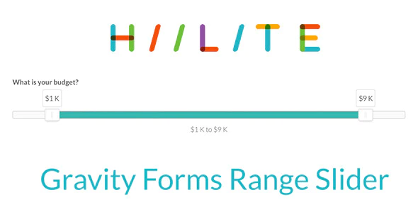
Want to integrate smooth, lightweight, customizable sliders into Gravity Forms? Until now, you have been limited in terms of options for both adjustable and tweakable sliders inside of Gravity Forms. With Gravity Forms Range Slider, you have a world of options to explore and create the ideal dual-handle slider for any purpose – without compromising on compatibility or speedy, seamless integration with full touch support – making it ideal for mobile or desktop usage on the full suite of major browsers.

How does our Gravity Forms Range Slider work for you? Responsive design and a wide range of integrated options and tools to design the right slider that fits your purpose. Bridging style and functionality, Range Sliders packs in more tools than you can shake a stick at. Want dual-handles for min/max values? It does that. Give users an interactive experience that encourages them to reach out and touch your webpage.
Installation
Installing “Gravity Forms Range Slider” can be done by using the following steps:
- Download the plugin after purchase
- Upload the ZIP file (gravityformsrangeslider.zip) through the ‘Plugins > Add New > Upload’ screen in your WordPress dashboard
- Activate the plugin through the ‘Plugins’ menu in WordPress
Usage
Step One:
- Create a new Form in Gravity forms, or select an existing form.
Step Two:
- Open the Advanced Fields tab within the form editor, and select the Range Slider.
Step Three:
Adjust the options for your range slider
Slider Type
Single Slider
- Select whether to use a single slider or a range slider.
Value Range
- Min: Minimum value of the range. Default minimum value is 0.
- Step: This is Step scale factor of the slider, default value is 1 and only allowing integer number unless minimum value is non integer number.
- Max: Maximum value of the range. Default maximum value is 100.
Range Defaults
- Start: Set the value the first handle should start at.
- End: Set the value the last handle should start at.
Formatting
- Prefix: A character value that will show in front of the values, typically used for adding a currency symbol to values.
- Separator: A character value that will show between the values, default value is a dash [ – ].
- Postfix: A character value that will show after the values.
- Show Tooltip: When active, display a tooltip above each slider handle with the value.
- Show Text Display: When active, display the current values of each handle below the slider.
- Decimals: Sets how many decimal points to show with the values.
Extras
Changelog
1.0.7
* 2017-07-19
* Fixed issue with Save and Continue
1.0.6
* 2017-07-06
* Fixed issue with AJAX and values passing between pages
1.0.4
* 2017-05-30
* Fixed major issue with Conditional Logic, now works both ways  Set fields to show based on the min or max values
* Added mergetag support. Include the min and max values in your calculations
1.0.3
* 2017-05-21
* Fixed issue with multiple sliders in same form not working
* Minor bug fixes
1.0.2
* 2017-05-06
* Fixed issues with inline scripts not loading
* Fixed single slider formatting issue
* Fixed bug with Gravity forms 2.2.1
* Fixed issue were turning off the text display on the single slider would break the slider
1.0.1
* 2017-05-03
* Added Thousands separator option
1.0.0
* 2017-01-10
* Initial release




Reviews
There are no reviews yet.