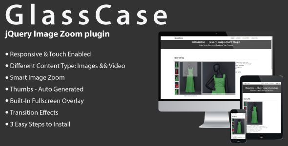
GlassCase is a responsive jQuery plugin that helps you to
add Image Zoom feature with
HTML5 Video && IFrame capabilities to your product view and gives to your customers an amazing viewing experience.
GlassCase is well designed, built from scratch and gives you some unique features.
You can easily integrate it in your project and deliver faster to your customers.
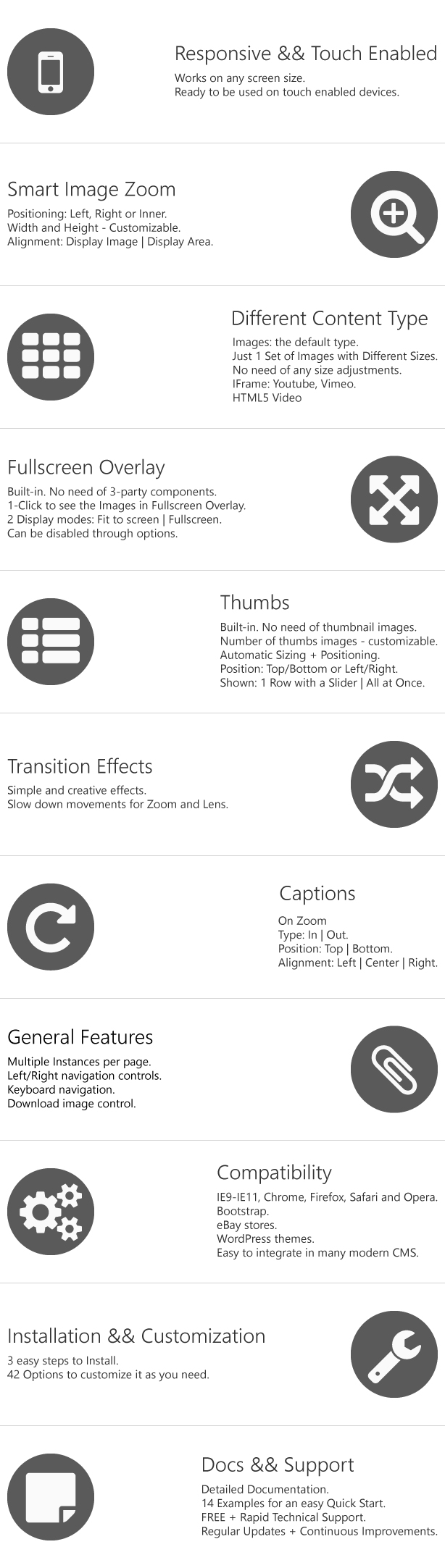
Key Features:
Note
- This is not a WordPress Plugin. GlassCase is a jQuery based plugin.
Take a minute to
see it
by yourself 
Have a
pre-purchase question to be sure that it’s suitable for you?
Then please send us a quick message via our
profile contact form.
What buyers are saying:
“I highly recommend this product to others who may be interested in purchasing GlassCase! tinyComp has been quick to respond
to support request and listened to thoughts on ways to improve GlassCase.
Five Stars well deserved!”
-ubhape2
“Hi I rarely writes comments, but this deserves one. Thanks for this one. This is a great plugin, it does what it should,
and it took not more than a half an hour to set up.”
-amja
“Hi, Lovely plugin and really easy to implement.”
-loudon
”… I just had to say how brilliant this is. It is working so perfectly and it solves so many image issues I was having.
I simply love this. It is now fully integrated into my website. To anyone thinking about getting this, it is quite simply
brilliant!!!!!!”
-pauld123
“Im very glad to fing classcase for my project. It’s very usefull.”
-soluma
You can find more reviews from real buyers on
comments
page.
Change Log:
3.0.1 – 08 April 2018
Fix:
- Fixed issue related to event handler declaration, Firefox specific;
3.0 – 24 November 2017
New:
- The whole component was re-written from scratch. It was changed how the component works internally, all the options have
been kept, except
isDownloadEnabled
that was deprecated. No changes were done to the option names. - To the component was added the capability of showing HTML5 Video and IFrame content. Were added the following options:
-
iframeWidth
– The IFrame width; -
iframeHeight
– The IFrame height; -
txtImgThumbIframe
– The text that is used by the image thumb holder, for the IFrame thumb image; -
videoWidth
– The HTML5 video width; -
videoHeight
– The HTML5 video height; -
txtImgThumbVideo
– The text that is used by the image thumb holder, for the video thumb image;
Also, were added data attributes(related to HTML5 Video && IFrame):
-
data-gc-type
– The type of the element. Possible values: IFrame, video; -
data-gc-width
– Defines the width of the container. Overrides the value defined in the plugin’s options. This data attribute
affects the following type of elements: IFrame, video; -
data-gc-height
– Defines the height of the container. Overrides the value defined in the plugin’s options; -
data-gc-formats
– This attribute is used only by the video element type. It is used for specifying multiple source files(multiple
formats) as a fallback in case the user’s browser doesn’t support one of them. The type of this attribute
is an array of strings; -
data-gc-poster
– This attribute is used only by the video element type. Provides an image to show before the video loads;
-
- To the component was added the capability of autoplay. Were added the following options:
-
isAutoPlayDisplay
– Enable or disables the auto play of the images; -
pauseTimeDisplay
– Time between the change of images enabled by isAutoPlayDisplay. Value is in milliseconds; -
isPauseOnHoverDisplay
– If set to true, on hovering the display image the auto play display will pause;
-
- To the thumb slider was added the option
slideType
– The sliding effect related to the thumbs area. Possible values: ‘slideRow’, ‘slideElement’.
2.1 – 11 February 2015
New:
- The posibility to add captions. Captions can be added in the Zoom Area;
-
isZCapEnabled
– enables / disables the Zoom Captions; -
capZType
– the type of Zoom Caption:
in
– placed inside the Zoom Area;
out
– Captions are placed outside the Zoom Area; -
capZPos
– the position of the Caption in relation to the Zoom Area; -
capZAlign
– the alignment of the text placed in Caption for Zoom; -
mouseEnterDisplayCB
– callback for the mouseEnter event of the display image; -
mouseLeaveDisplayCB
– callback for the mouseLeave event of the display image; - When processing the images, the ones that have the same href will be removed.
Fix:
- The image’s
ALT
is saved and passed;
2.0 – 30 October 2014
New:
- The component was made touch friendly;
- Were added the options to set the thumbs on left or right side of the Display Image;
- The icons were changed to another set;
- Was changed the loading wheel(it uses CSS3)
- New option:
isHoverShowThumbs
– on hovering a thumb it will change the Display Image; - Was added a new Zoom position: Inner – The Zoom will be shown inside the Display;
- New option:
autoInnerZoom
If the Display and Zoom do not fit on the page, Zoom will be shown in inner position; - Was handled the case when an image is not loaded: in this case it will appear a holder.
1.4 – 16 September 2014
New:
-
The zoom’s width and height can be customized. It can be aligned to the image container or the image area;
-
isZoomDiffWH
– Determines if the zoom’s width and height have different values; -
zoomWidth
– The width of the zoom. The value is in px; -
zoomHeight
– The height of the zoom. The value is in px; -
zoomAlignment
– Possible values: ‘displayImage’, ‘displayArea’.
-
-
zoomMargin
– The distance between the zoom and display area; -
thumbsMargin
– The distance between the thumbs and display area;
Fix:
- The opacity of the image in the overlay, in ie8;
- The issue related to: clicking on a selected thumb, it disables the selection of another image;
1.3 – 5 September 2014
New:
-
isOverlayFullImage
– If true the image in overlay will be shown in full size and only. If false the image will fit the display. On double
clicking, the image size will be toggled. If the image is in fit => after double click it will be shown in full size.
If the image is in full size => after double click it will fit the display; - In overlay, clicking outside the image will close it;
-
isSlowZoom
– Enables the effect of “slowing” the movement of zoom; -
speedSlowZoom
– Determines how long the animation will run. The speed is given in milliseconds; -
isSlowLens
– Enables the effect of “slowing” the movement of lens; -
speedSlowLens
– Determines how long the animation will run. The speed is given in milliseconds; -
speed
– Determines how long the animation will run. The speed is given in milliseconds. This value is used in the animation
of lens; zoom; overlay; slide; - Added to the selector ”.gc-zoom-container img”: “max-width: none !important;”.
1.2.1 – 24 August 2014
Fix:
-
If firstThumbSelected will be greater than the total number of thumbs then to firstThumbSelected will be assigned it’s default
value.
1.2 – 31 July 2014
New:
- The GlassCase component was made responsive;
Fix:
- Corrected the height of the component when it has no thumbs and only the display is used.
1.1.1 – 12 July 2014
Fix:
- Bug related to the case when the number of images is one more than the number of thumbs per row.
1.1 – 09 July 2014
New:
-
isZoomEnabled
– Enables or disables the zoom; -
isOverlayEnabled
– Enables or disables the overlay.
Fix:
- Changed the script so it could properly work in IE8;