
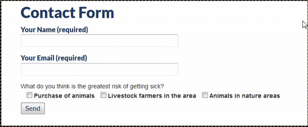
Show A Field Only When All Checkboxes Are Selected In Contact Form 7
By OutsourcedContent — on October 12, 2017 You might want to read this post on how to conditionally display fields in Contact Form 7 plugin with simple JavaScript first to get some context. Here we are trying to display a line of text when all checkboxes are checked. Here is the result. Here is the…